Friday, December 2, 2011

Featured Artist

Susan Spohn
Susan paints in oils and is a colorist who is also interested in the thick textures obtained using a pallet knife. A Colorado artist, Susan presently resides in the small town of Salida, Colorado, located in the Arkansas Valley surrounded by mountains and valleys, rivers, forests, lakes, and tourists. Residing in an old brick building in the historic district, she has a small, porch-like enclosed studio on the second floor, overlooking the back alleys near downtown.
What interests you about painting animals?
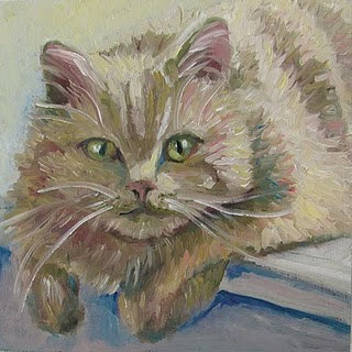
I mainly do not paint animals... only in this small format as part of my daily painting routine, and now, I also do pet portraits in this 7 x7 format. (and I am now taking orders for the Christmas gift time) I really like animals. I think they are all beautiful. I never know 'how' I am going to paint them. I just start painting and they sort of paint themselves, with only a few complications that I need to solve along the way. I do not use black or any earth tone paint on my pallet. I mix all of these colors. This keeps my colors more vibrant, and at the same time creates more mixing work for me! As an example, a cat I painted, was painted entirely using sap green, and sap green mixed with other colors. The finished cat painting looked creamy with a touch of orange; just as the original photo suggested.

Are there particular artists who influence your work?
When I am participating at an art show with my other paintings (florals, treescapes), most folks see a strong influence post-impressionistic painters in my style; especially, Vincent Van Gogh It always amazes me, since I do not consciously study Van Gogh or think about his painting style when I paint. I feel I am an emotional painter, letting my instincts control the paintings more than a photo reference or perhaps rules of the art world. I appreciate all painters with a looser painting style. And my pet portraits and animal paintings are about as 'tight' as I get in my painting style, my other paintings are much looser.

Are there new themes or mediums you anticipate exploring in your upcoming work?
I am now working on some oil and mixed media pieces in a more abstract style. I can envision a series of these in the future. In addition, I see my floral pieces becoming even looser and more abstract. I will continue painting my small animal and pet portraits; they are a wonderful creative exercise and I never know how they will turn out.

Many thanks to Susan for sharing her lovely paintings!

What do you think of Susan's work?
Pin It!

Monday, November 28, 2011

Western Avenue Series

Mile 16: Kinzie-Division
This sketch is a part of my Western Avenue Series, through which I'll be making 24 watercolor paintings, one to document each mile of Western Avenue, in Chicago.  I started this project because while it is not considered to be among the most “beautiful” of Chicago’s streets, Western Avenue is a perfect place to document the humanness of Chicago, the positive and the negative. In the words of Stuart Dybek, "Western, with apologies to State Street, is a great street,  Unlike State, it is a street that goes to the interior, the heart of the city, as it glides and glows through a United Nations of neighborhoods."  Check back next Monday to see a painting based on this sketch.
This stretch of Western has a variety of building types, small storefronts, like pharmacies, bars, restaurants, in addition to buildings with larger footprints, like a car dealership, which is the subject of the upcoming painting, a church and some larger condo buildings.
I've always been moved and sobered by the Ghost Bikes, bikes painted white to memorialize cyclist killed.  You see the bikes around the city and in doing a bit of research, I found that the Ghost Bike along this stretch of Western, memorializing Isai Medina, was the first in Chicago.  The unique bike used in this memorial was Isai's invention.  It seems that Mr. Medina, who was killed while riding home from worked was well known and loved, with over 400 people attending a memorial ride soon after his death.  He regularly rode his bike from Evanston to 4700 South for work each day. 
Finally, a correction.  I sung the praises of The Empty Bottle in the entry regarding "Mile 14" of the Western Avenue Series, mistakenly asserting that the bar and music venue is located along that stretch.  Actually, the Empty Bottle is located in this mile, just south of Division.  


Rest in peace Isai Medina and others lost is cycling accidents in our city.
Pin It!

Friday, November 25, 2011

Featured Artist

Michael Hendrix
Michael Hendrix is a painter and science educator in South Burlington, Vermont. He is currently working on a series of paintings using coffee, tea, and other consumable liquids as the media. He can be found on Etsy at www.etsy.com/shop/theretrievers and on Facebook at www.facebook.com/#!/pages/TheRetrievers-at-Etsy/245075195534019 .

What inspired you create a series of paintings using coffee, tea, and other consumable liquids as the media?
      I live in a part of the country that, as a community, is generally very conscious of what is ‘consumed’. Vermonters have a tendency to go out of their way to question what is eaten and where their groceries are grown, and regularly support local farmers and businesses – something that was basically neglected where I was born and raised. When I first moved up here six years ago, I immediately found my eating habits challenged. This isn’t to say I was a ‘terrible’ eater, but I would have considered myself a ‘neglectful’ eater. To be honest, I’m still working on that!
      In many ways, the “Blend” series is an echo of my experiences since living up here. For me it represents getting back to the basics. Even the paints we consume are synthesized and chemically created. How many people actually know what’s in their paints, or gouaches, or watercolors prior to putting color to paper? I know I don’t. It’s sort of funny and ironic to me that art – the way that many of us relate our ideas and communicate – is, at it’s basics, created using all these bizarre chemicals that we are actually estranged from. I want to create a conversation about my work, but do I have really have the right to ask someone to think about what they consume if I can’t really converse about the basics of the media I’m consuming to create it?
      I don’t want to imply that I think my way is best, but I think that in the context of the “Blend” series, using consumable media is appropriate. I’ve always tried to stay conscious of Marshall McLuhan’s admonition that “the medium is the message” while working on these paintings. I want people to think differently about what they put into their bodies, and to look at coffee, tea, wine – whatever – and think about how these things come together in a bizarre alchemy to keep us alive. There’s another use of them besides stuffing them in our mouths. As creators, there is also a HUGE range of beautiful tones and natural colors that are immediately available all around us that we choose to neglect because we aren’t thinking about them. We (and I include myself in this) tend default to what we’ve been prescribed: that color only comes out of a tube, and that we can’t create without going to the art store to buy something. For this series at least, I felt a little silly trying to use colors that I myself wasn’t intimately involved in deriving.

The natural surroundings in Vermont seems to have inspired your Birches series, as well as some of your landscapes. What do you love about Vermont?
     One of the advantages of living in a predominantly rural state is that you really feel like you’re a functioning part of the environment, even in the ‘big city’ like Burlington (which is still tiny compared to cities in most other states). The light here is unbelievable and sort of supernatural, especially in the evenings. That has to be my favorite aspect of where I live. It sounds sort of silly, I guess, but I think it’s influenced my color range a lot.
      In the summer, Vermont is a very, very vibrant green. In the Champlain Valley, where I live, the Adirondack Mountains are clearly visible across the lake, and tend to be a very distinct blue in the late in the afternoon. In the evenings, things become draped in a strange violet hue, but the sky gets very bright red. In the fall, there’s a period of about a week and a half where the maple leaves are a fiercely saturated orange, and stand out against the complementary bright blues of the sky. Then it typically rains really hard once and then everything hits the ground and turns to a mess… Novembers are visually muted and muddy and generally unpleasant. Winters are long, and the constant blanket of snow makes the darkest midnight really bright in the reflection of the moon. There’s a really wide range of colors going on here, some of which I’ve tried to catch in the little landscape paintings I’d posted; the “Birches” series is more playful and focuses more on the nighttime contrast and positive-negative space you see around here in winter. 

Are there new themes or media you anticipate exploring in your upcoming work?
Absolutely, and I think you’ll see more of it in the “Blend” series as I learn to articulate these ideas a bit more in the future. I’m always a little skeptical when an artist tells someone what they should be seeing. My personal contention is that a good artwork should be reasonably conversational and directional, but not dictating. In my experience, it’s always more gratifying when you work something out by yourself rather than being told what to see. A good piece of art, like a good conversation, should effectively communicate ideas and really spark the audience to approach an idea in a way they normally wouldn’t have thought of it. It should be a catalyst.
     Ok, stepping off my soapbox, there ARE several themes that I’m moving towards that I hope people will notice if they keep popping by the shop. I’m really interested in the idea of circles and what they imply about infinity and cycles, so you’ll see more of these. I’ve also been exploring the idea of repetitive forms and what it implies about addiction and habits, I’m planning on incorporating more plain water into the paintings, which incidentally, I’ve found erases layers of color set down by coffees and teas. I think there’s a really beautiful purification statement in there somewhere that I still need to develop, but it’s very unpredictable during the drying process and I’m working out the kinks of working with it. The fact that coffees and teas can be erased through water also relates back to their impermanence, which is something I’m very concerned with. And finally, being a scientist, I want to imply topics relating to cells and birth/creation/division. I don’t think art and science are mutually exclusive disciplines, especially when it comes to analysis. They are so similar, and no one seems to give that relationship any credit these days. Anyway, hopefully a few of these little clues will help people see something they didn’t notice in the paintings - without telling them how to interpret it.
    Right now I’m knee deep in the “Blends”, and future paintings will incorporate alcohols, especially wines, and some new teas and coffees into the mix. I’ll be revisiting the birches too, but there’s so much to say with the more recent work that I think I’ll be communicating this way for a while!

Many thanks to Michael to sharing his work!

What do you think of Michael's fantastic "Blend" series?
Pin It!

Monday, November 21, 2011

Western Avenue Series

Mile 15: Congress-Kinzie
This painting is a part of my Western Avenue Series, through which I'll be making 24 watercolor paintings, one to document each mile of Western Avenue, in Chicago.  I started this project because while it is not considered to be among the most “beautiful” of Chicago’s streets, Western Avenue is a perfect place to document the humanness of Chicago, the positive and the negative. In the words of Stuart Dybek, "Western, with apologies to State Street, is a great street,  Unlike State, it is a street that goes to the interior, the heart of the city, as it glides and glows through a United Nations of neighborhoods."  Check back next Monday to see a post about the next mile of Western.
It has been a challenge to stay on top of my work on this Western Avenue Series with my recent schedule change.  I am now working a full time architecture day job and facilitating a design studio three nights a week.  So, completing a painting seems all the sweeter.  I finished this painting last night and enjoyed the charm of this little building associated with the Metra train line with vines growing all over it.  Hope to have another completed painting in two weeks! 
Pin It!

Friday, November 18, 2011

Featured Artist

Elisaveta Sivas
Elisaveta Sivas is an artist-designer and who works in a few different artistic fields, including painting, ceramics and costume design. Elisaveta used to be a university researcher, but her desire to create art was strong, so she had to leave the university. She studied costume design in an evening school and art in different courses and studios. Elisaveta sees the creative process first of all as a way of understanding and improving herself and of understanding this world.
What do you love about the horses and birds which make frequent appearances in your art?
My horses and birds come from my childhood. It's something very dear to my heart, pure and intimate.  I suppose what we create tells much about what we feel. I think that a bird for me symbolizes my desire for being free and flying free, but sometimes also escaping from difficult life circumstances. They also represent for me grace and fragility and remind me of women. While the horse provides a feeling of stability, power and security. And also it's a symbol of nobility, grace and calm in my soul.
Are there particular artists who have influenced your work?
I love many artists, they have all influenced my work. I love Marc Chagall, Pierre Bonnard, Maurice Denis, Leon Bakst, Mikhail Vrubel, Michel Macreau and many others. I love Art Brut, Art Deco, Naïve art. I adore Kashan ceramics and Japanese graphics. Classic music gives me a lot of inspiration. I like a lot Pier Paolo Pasolini and Andrei Tarkovsky. I love a lot Rustam Khamdamov, I adore his films and paintings.
Are there new themes or mediums you anticipate exploring in your upcoming work?
As to the mediums, I've started to make collage from tissue and wool lately. I have some material left from designing clothes, I use it for my paintings. I really do enjoy it. I love making woolen mane and tales for my horses and sometimes I make saddles from tissue. I make tissue dress and woolen hair for my women portraits.
As to the new themes, I've started to be interested in women's faces. It's a challenge for me, I am still searching my way and technique to paint women.
Many thanks to Elisaveta for sharing her work!

What do you think of her fantastic paintings?
Pin It!

Monday, November 14, 2011

Western Avenue Series

Mile 15: Congree-Kinzie
This sketch is a part of my Western Avenue Series, through which I'll be making 24 watercolor paintings, one to document each mile of Western Avenue, in Chicago.  I started this project because while it is not considered to be among the most “beautiful” of Chicago’s streets, Western Avenue is a perfect place to document the humanness of Chicago, the positive and the negative. In the words of Stuart Dybek, "Western, with apologies to State Street, is a great street,  Unlike State, it is a street that goes to the interior, the heart of the city, as it glides and glows through a United Nations of neighborhoods."  Check back next Monday to see the painting based on this sketch.
This stretch of Western is characterized by a number of building of a larger scale.  Recently build new condo buildings, larger institutional buildings and some early 20th century office buidlings.
This portion of the avenue is very close to the United Center (home to the Chicago Bulls), which is located at Damen Avenue and Madison.  
This stretch also passes near to the Western Avenue Metra Stop, near to which the train building featured in this upcoming painting is located.
Pin It!

Friday, November 11, 2011

Featured Artist

Cindy Ruprecht
Cindy Ruprecht's inspiration comes from nature. All of her pieces reflect her love for the beauty of the natural world. As a studying naturalist, she enjoys painting, working with leather, beads, basketry, primitive skills of any kind, and studying native plants. She lives in the beautiful Cascade Mountains where she produces her artwork.

Are there places you would like to visit to gather inspiration for future work?
I would love to paint in the southwest....the beautiful color of the rocks and amazing blue and turquoise of the sky.

Does working with leather, beads, and basketry influence your painting work or vice versa?
I love the texture and richness of working with leather, beads, plant and animal fibers. There is a connection with the ancient ones, while doing this, and your spirit begins to remember.  In my paintings, I love to focus on mother nature's creation as a forum for education. As a naturalist, art is a means to educate people on their surroundings and bring their awareness to the beauty around them. 

What do you love about creating art, which reflects the beauty of the natural world?
I like to meld the art, spirit and nature in my paintings, as there is no separating these three. One supports the other. The spirit of nature is so important for people to connect with in these times, especially children....We need to get our children connecting with the earth again.

Many thanks to Cindy for sharing her work!

What do you think of Cindy's work?
Pin It!

Monday, November 7, 2011

Western Avenue Series

Mile 14: 16th-Congress Streets
This painting is a part of my Western Avenue Series, through which I'll be making 24 watercolor paintings, one to document each mile of Western Avenue, in Chicago.  I started this project because while it is not considered to be among the most “beautiful” of Chicago’s streets, Western Avenue is a perfect place to document the humanness of Chicago, the positive and the negative. In the words of Stuart Dybek, "Western, with apologies to State Street, is a great street,  Unlike State, it is a street that goes to the interior, the heart of the city, as it glides and glows through a United Nations of neighborhoods."  Check back next Monday to see a sketch of the next painting in the series.
Finally!  I have completed the next painting in my Western Avenue series.  The last weeks have been marked by transition.  I have gone from working part time and free lance to full time position with an architecture firm in Chicago.  I have also started teaching in the evening design program at Archeworks.  So, I've been in the process of transition, but hope to return to a more regular schedule of Western Avenue paintings.  I really enjoyed showing two of the paintings in the a.DOT show last month and giving an artist talk about the series.  I am looking forward to an opportunity to show the full series once they are all complete.

This painting depicts an auto repair shop.  It's not extraordinary, but seems quite typical of the part of Western in which it is situated.  The street is lined with small businesses, but many of the storefronts are quite utilitarian in nature.


Click here to purchase this painting.

Looking forward to moving further north, only ten paintings to go!
Pin It!

Monday, October 31, 2011

Painting

Jackson Park Lagoon
This painting is soon to be a part of a exhibit curated by Sabina Nieto of mauve? fame.  The show is titled "In Brief: a Private Study" and will be located at Adobe Bookstore Backroom Gallery, in San Francisco.
Pin It!

Friday, October 21, 2011

Featured Artist

Shelby Taylor
     I seek out to create an infringing force within our humanity by using the figure and concept of the animal. The images I create focus on encroaching animals in places and forms that we consider properties of humanity. My earlier work was based in creating an illusive image with exaggeration in proportion and form, but as I progress my works relate to interrupting a reality through more subtle inclusions of the animal form in it's natural state.
     This motif that carries through in my images is based in the manner in which I spent my childhood. My home city is that of Sault Sainte Marie, Ontario. Sault Ste. Marie is a smaller city located along the Saint Mary’s river in between Lake Superior and Lake Huron. My home was on the fringe of the city. From the time I was born until I moved away to London to take on my post-secondary education the wild was a part of my day to day life. It was not uncommon for recess in elementary school to be canceled due to a bear wandering onto the playground. I had bears, foxes, moose, wolves, dear etc... in my back yard frequently. What was mine and what was nature's was, and still is, a vague boundary.
     Apart from my cultural philosophies founded in my upbringing, the study of anthropology fuels my concepts. I am very interested in how the animal functions within humanity. Whether it be economics, cultural fables, our food…etc, anthropology provides a backbone to my conceptual research.

Are there particular characteristics which attract you to the animals you feature in your paintings?
What draws me to the animals I depict stems from a personal correlation I share with the creature either through experience or culture. The choice of animal is often the result of the space I wish to use, but can work vice versa as well. The animal I choose has to share some strong cultural significance with the space I choose to depict it in.
Where do you find the inspiration for the spaces in which you place your animals?
I always have a camera on me. I never know when I'll discover the next architectural space I wish to explore in my work. Sometimes I will have an idea set before I find the space, but more often than not it's pure chance that I discover a space that would serve well in my work and have great compositional value. For example my piece Foam actually depicts my bath tub from my old apartment. The idea came to me while actually taking a bath. I realized the composition of shampoo bottles and loofas was brilliant.
Are there particular themes or mediums you anticipate exploring in your upcoming work?
I've been dabbling in some ink drawings based on the field of Biomimcry, but it has become a side project for now as I am completing some paintings from some concepts I had at the beginning of the Summer. My preferred medium is acrylic paint. I find there is much more experimentation happening with the acrylic paints that allow me to explore the effects of iridescent and interference colours in my work. I find myself also beginning to integrate part of the animals' natural environment into our own subtly through color and form.

Many thanks to Shelby for sharing your beautiful paintings.

What do you think of Shelby's work?
Pin It!

Sunday, October 2, 2011

Featured Artist

Kevin McCain
Kevin McCain is a Plein Air painter whose Impressionist paintings and drawings are in the collections of patrons across the United States, Mexico and Brazil. Kevin McCain lives in central Arizona, surrounded by the landscapes he loves to paint. Kevin’s use of vibrant colors and thick impasto give his paintings a life and vitality to capture the viewer’s attention. His landscapes have a dreamy quality to them. His paintings are more reminiscent of memories rather than an illustration of a particular scene. The impression of the landscape is more important than the actual content.
What challenges and advantages do you find with Plein Air painting?
Plein Air painting is great, packing your studio up and entering into the wilderness. There is something very romantic and adventurous about the idea. You get outdoors see beautiful scenery and paint from nature in the fresh air away from the studio get you daily dose of vitamin E what could be better? The downside of course you are painting outdoors at the mercy of nature. I mean of course your have the bugs biting ants, annoy-some mosquitoes, and biting flies I won't even start on the scorpions and snakes in the desert. You also have the weather. Winds whip around you and sometime take you easel with it. You are painting one moment then you get caught in a cloud burst and rained out. There is also the rare occasion of a chance and not always friendly encounter with local wildlife. With all that said one may wonder why you would go to all the trouble to get outside and paint. The answers is the you see more when you paint outside. Photographs just do a good job with subtle color. The camera doesn't perceive color the same way the human eye does. So when you paint outside instead of from photographs you can see different colors. Also being surrounded by what you are painting in the landscape for me makes painting so much more interesting and inspiring which translates into better artwork. Though it may not be for everyone painting in the outdoors with all the drawbacks make me a better painter. It makes painting a greater adventure.
Are there particular places you like to visit to gather inspiration for future paintings?
I was born and raised in Arizona. Arizona is in my blood. The great thing about Arizona is it's diversity.  It is the only state in the country that has every ecological zone. From the low deserts, to the grass lands high deserts, Pine and Aspen forests to above the timber line. It is that unique quality that makes Arizona such a great place to paint as an artist. Whatever you are looking to paint it's all just a couple of hours away from anywhere in the State. I have been all over the western states and Arizona is my favorite place to paint.  Having been raised in the Sonoran deserts I rarely feel more comfortable and at home than painting the desert and especially the unique places of the Superstition Mountains. Mountains that in and of themselves are rich with myth and legends of lost treasures and unseen places that few have visited and from which even fewer have returned. I love these stories which help to feed my creativity as an artist. The Deserts of the Superstitions will always be a reoccurring theme in my painting. Desert landscapes paintings of lonely desert scenes or secluded Canyons of the Superstition wilderness. These bring me comfort and even Peace. I love the desert! It will always be home.
Are there are particular themes or mediums you'd like to explore in future work?
My landscapes are more than just pictures of places many of them are of unique places that now because of urban development are lost forever. Just as the French impressionists were conscious of the urbanization of the lands throughout France and of the impact man was having on nature at that time. I believe that it is very poignant theme still today especially for the dry country of the Western United States. I explore the continuing theme of man and his interaction with the land. I believe it is our responsibility to preserver our natural places and leave as little impact on the land as possible. I will continue to encourage responsible action in management and development of our lands in the future through my art work.
Many thanks to Kevin for sharing his work.

What do you think of Kevin's plein air paintings?
Pin It!

Sunday, September 25, 2011

Western Avenue Series

Mile 14: 16th-Congress Streets

This sketch is a part of my Western Avenue Series, through which I'll be making 24 watercolor paintings, one to document each mile of Western Avenue, in Chicago.  I started this project because while it is not considered to be among the most “beautiful” of Chicago’s streets, Western Avenue is a perfect place to document the humanness of Chicago, the positive and the negative. In the words of Stuart Dybek, "Western, with apologies to State Street, is a great street,  Unlike State, it is a street that goes to the interior, the heart of the city, as it glides and glows through a United Nations of neighborhoods."  Check back next Monday to see the painting completed based on this sketch.
The Express Auto Repair shop featured in the painting seems typical of the businesses which populate the surrounding blocks.  The street is more densely lined with businesses and apartments than some portions of the Avenue, but still does not seem entirely geared toward pedestrians.  The focus remains on the car with fast moving traffic, generously proportioned streets, and car repair shops. 
I was curious about the Center for General and Applied Education, which is located on this stretch of Western.  They describe themselves in this way, "We are a special educational center where we want you to learn everything there is to learn so you
could become:

A versatile, knowledgeable individual.


We can do this because we sift, sort and integrate knowledge, separating it from the minutia, the 
redundancies and the excessive elaboration to the point of boredom, so the essence of our collective 
human knowledge gets passed on to you."

The Empty Bottle, a lovely place to see music because it is fantastically intimate, is also located on this stretch of the avenue.  I've seen Harlem Shakes, Noah and the Whale, and The Mountain Goats at the Empty Bottle, all delightful shows!
Pin It!

Friday, September 23, 2011

Featured Artist

Martha Bleidner
Martha Bleidner has been creating all her: life, drawing, writing, making jewelry and crafts. For her, it's all about colors, textures, shapes, and a little bit of fantasy. She's never been able to settle for just one style or genre or technique. She finds that there's always something new to try, or different techniques to merge. This led Martha to spend a number of years as a professional needlecraft and craft designer. With a partner, Celia Lange Designs, Martha designed needlecraft and craft projects for a number of different publishers, including Leisure Arts, The Needlecraft Shop, House of White Birches, and Workbasket. She most enjoyed projects which were the ones which "pushed the envelope", combining techniques from different sources, such as working embroidery stitches over a background of needlepoint stitching, or adding dimensional craft elements to a needlecraft project. This love for pushing the boundaries and mixing elements means that she is always exploring new directions in her art and her crafting.
What attracts you to the fantastical in creating art?
     I've always loved reading fantasy, mythology, folk and fairytales, and science fiction, since they all invite my imagination out to play. My father was a scientist, so I learned early on how to analyze what's around me and think in a linear fashion, but I also learned to take science "with a grain of salt". Too many times I've heard some "expert" pronounce that something doesn't exist or isn't possible, and then some years later the it turns out that the "extinct" fish still swims in the ocean or the "impossible" particle has been located. So I try to keep an open mind and allow the fantastical to be a part of my reality, and incorporate it into my art.
Where do you find the inspiration for your landscape paintings?
     Over the years I've been fortunate enough to travel a lot, and I've always been drawn to nature. Whenever I see something that catches my eye, I take a mental "snapshot". This gives me a sort of "impressionist" version of what I've seen, rather than the "reality" version of a true snapshot (although I do use those as well, sometimes). Then, when I want to paint, I use a combination of one or more mental and/or physical snapshots, mix them with a good dose of imagination, and add an element of letting the working medium guide me.
    Sometimes I have one thing in mind, and the paint just insists on leading me somewhere else. For example, I recently started a seascape, but what I was envisioning and what I was producing weren't on the same page at all. So I stepped back and stopped fighting to make it a seascape... it ended up being a really cool background to a still life of an orchid-like flower in a pot... not looking like anything else I'd ever done before... I still have no idea why it ended up that way, but I like it.
Are there new themes or mediums you anticipate exploring in your upcoming work?
     Always! I'm notorious for wanting to try everything I see. I've started exploring acrylics and experimenting with gel mediums and interference colors. There are so many wonderful effects you can get with color intensity, texture and color shifts. I'm currently waiting for a back order of Inktense blocks so I can begin to experiment with the effects of using ink rather than paint as a water medium, and I've also started some collage pieces using a variety of techniques that I originally used for scrapbooking, but applying them in very different ways.
    I suspect, though, that I will long continue to work with watercolor as one of my primary media. It's one of the handful of methods of expressing myself that always seems to have something different for me to achieve. And since my styles range from semi-realism to fully abstract, that says a lot!
     As for new themes, I have more themes lined up and waiting impatiently in my mind than I know what to do with! At this point, I have my art supplies set up in three different locations, and have at least five or six pieces going at any one time. Usually which themes are expressed in which location depends on the supplies I have there, but I have been know to carry a partly finished piece to another location just to finish with a different paint or brush or glaze or whatever. I guess my motto should be, "have art, will travel".
Many thanks to Martha for sharing her lovely work and happy birthday Martha!

What do you think of her paintings?
Pin It!

Monday, September 19, 2011

Western Avenue Series

Mile 13: 25th-16th Streets
This painting is a part of my Western Avenue Series, through which I'll be making 24 watercolor paintings, one to document each mile of Western Avenue, in Chicago.  I started this project because while it is not considered to be among the most “beautiful” of Chicago’s streets, Western Avenue is a perfect place to document the humanness of Chicago, the positive and the negative. In the words of Stuart Dybek, "Western, with apologies to State Street, is a great street,  Unlike State, it is a street that goes to the interior, the heart of the city, as it glides and glows through a United Nations of neighborhoods."  Check back next Monday to see a post about the next mile of Western.
This painting features one of the modest homes which line the streets of Pilsen.  This small house is nestled among the larger and more commercial buildings, which line Western, but it certainly typical of the urban fabric in this area.  The entrance of these homes are typically a full story above the exposed basement, which offers the opportunity for small gardens to flourish below the street level and gems to be hidden out of the view of the unobservant passerby.  


Click here to purchase this painting.


What do you think of these Pilsen homes?
Pin It!

Friday, September 16, 2011

Featured Artist

Jaime Perry
Jaime Perry is a 35 year old mom and artist. Jaime specialises in oils; portraits, landscapes, still lives and ACEOs. She many painting styles; surrealism, realism, & impressionism are my favorites. She can also do modern, abstract, and will create custom paintings.
What interests you about the ACEO (Art Cards) format?
I have only recently discovered the ACEO world. It allowed me to go through some smaller work from numerous sketch pads and get those out there. Before I offered Aceos in my shop, I had mostly very expensive large oil paintings. This left me open to only a small market of buyers, and very few sales. The Aceo format allows me to open up to collectors who can't afford, or who don't have room for a major art investment. I love that they are sought out and collected. I can get my work out to a much larger audience and share my talent with more people, what's not to like? I have sold 3 since I started offering them in June.
Where did you find the inspiration for your pin up girl series?
I have been on a pursuit since my teens to make a living with the talent given to me. In the summer of 2000 I started an apprenticeship at a tattoo shop, in the hopes that would be the answer to making a living from my art. As well as learning the art of tattooing, also tried my hand at designing tattoos to sell to other shops. The pin up girls were a part of that. I drew several girls, some from magazines some from my imagination, in a simple black line form. I then arranged them on a large sheet and attempted to sell the whole piece of flash. The original stayed in my portfolio for years. When I discovered Aceos, I decided to give my girls a new start. I cut them down to the proper size and mounted them on card stock. I have always loved the old pin up girl style, and I enjoyed drawing them very much.
Are there are particular themes or mediums you'd like to explore in future work?
I am always trying new things and keeping my mind open to new styles. I don't want to be stuck in an artistic box. I have always loved sculpture and pottery. I will be able to pursue that avenue once my family is settled and own a home. That way I will be able to have a kiln, potters wheel, and room to work. I would also love to get a handle on watercolors. They have always been my weak point. One day I hope to conquer that medium and move on to bigger things. I will never know everything in art, but I will never stop trying to learn all that I can. I have even started to teach myself to sew. My philosophy is if it can be done by human hands, there is no reason I can't learn to do it.
Thank you much to Jaime for sharing her work.

What do you think of Jaime's paintings and drawings?
Pin It!

Monday, September 12, 2011

Western Avenue Series

Mile 13: 25th-16th Streets
This sketch is a part of my Western Avenue Series, through which I'll be making 24 watercolor paintings, one to document each mile of Western Avenue, in Chicago.  I started this project because while it is not considered to be among the most “beautiful” of Chicago’s streets, Western Avenue is a perfect place to document the humanness of Chicago, the positive and the negative. In the words of Stuart Dybek, "Western, with apologies to State Street, is a great street,  Unlike State, it is a street that goes to the interior, the heart of the city, as it glides and glows through a United Nations of neighborhoods."  Check back next Monday to see the painting completed based on this sketch.
This stretch of Western travels into the Pilsen neighborhood, a place that has long been home to immigrants. In the late 19th century Pilsen was inhabited by Czech immigrants (Plzeň is the fourth largest city in what is now the Czech Republic).  Later, the Czechs were replaced by the Germans, who had settled there first with the Irish in the mid-19th century. In the mid-late 20th centeury there was an increasing Mexican-American presence, in 1962-63 when there was a great spurt in the numbers of Mexican-Americans in Pilsen due to the destruction of the neighborhood west of Halsted between Roosevelt and Taylor Streets to create room for the construction of the University of Illinois at Chicago.  Latinos became the majority in 1970 when they surpassed the Slavic population.  Famed author Stuart Dybek hails from Pilsen. 
Many of the new residents to the neighborhood are not Hispanic and it is projected that the neighborhood will continue to become more diversified in the years ahead.   Some local advocacy groups have formed urging the neighborhood's alderman to curtail gentrification to preserve the Mexican-American cultural and demographic dominance. 
The neighborhood is home to one of Chicago's largest art districts, and the National Museum of Mexican Art. St Adalbert's is a dominate feature of Pilsen skyline, as well as the murals which are prominently featured in the neighborhood. The history of the murals is often misspoken of as a purely Mexican cultural type. The original murals in Pilsen along 16th Street started as a cooperative effort between Slavs and Mexicans when the neighborhood was undergoing change. If one looks closely one finds amongst the latter Mexican images the earlier ones which are decidedly non-Mexican and include storks, scenic European farms, and lipizzaner horses.
My personal favorites in Pilsen include the National Museum of Mexican Art (free and fantastic) and the Green BLT sandwich at the Honky Tonk Restaurant.  I'm also very fond of the modest but well proportioned wood frame homes of the neighborhood.  Many of these homes reveal the a bit of the city's history with exposed basements, which used to be first floor before the city raised the level of the houses in the 1860s and 1870s.

What do you love about the Pilsen Nieghborhood?
Pin It!

Thursday, September 8, 2011

Featured Artist

Phuong Duong
Phuong is a painter of still life, using oil on canvas. Her paintings are spontaneous and emotionally charged. Though she is not a very prolific painter, she hopes that this may be made up for, by the depth and richness of her interpretation. She admits that naturally she is quite a closed book, described as “still waters”. Paint allows her freedom from consciousness.

Austerity, Seniority, Frivolity and Fertility, oil on canvas, 76 x 101 cm, 2010
Self-imposition, loneliness and heartbreak.
Last Bloom, oil on canvas, 60 x 80 cm, 2010
There's the Jeff Buckley lyric "It's never over, she's the tear that hangs in your soul forever".  Mary, whom I met in hospital, represents that feeling.  Sometimes in life you look for angels and a lot of emotions about that time are wrapped up in her memory.  She had written me a card a few months after we had met, with great difficulty.  Her writing was shaky and frail and tailed off from the cramp rendering chemo as she wrote about her hair falling out.  That evokation remains a stubborn memory.  It is deeply personal, the things you can't let go that becomes a part of your being and subconscious.
Blue, oil on canvas, 60 x 90 cm, 2010
Blue is the most innocent of paintings.  It is optimistic and simple. Comme c'est difficile d'etre simple.
A candlestick, vase with flowers and apples, oil on canvas, 76 x 101 cm, 2011
     I was thinking a lot about yellow and light.  I was thinking a lot about Van Gogh as I always do for inspiration.  This was a painting responding to the artist and his influence.
     I paint because it can feel like it only means something to me and that's a precious thing indeed.  I like that I can go my merry or downbeat way with complete freedom.
      Painting is a practice of natural instinct, memory and urgency.

Many thanks for Phuong for sharing her delightful oil paintings.

What do you think of Phuong's work?
Pin It!