Friday, July 29, 2011

Featured Artist

Jenny Belin
Jenny Belin is a redheaded, Los Angeles expatriate. She began taking art classes when she was very young, and then studied art more seriously in high school and college. She graduated from Skidmore College, with a bachelor's degree in painting, and then moved to New York City, where she currently resides Her work is largely autobiographical, inspired by the photographs and diaries that she kept when she was a child. She has worked as a professional artist for fifteen years. Her drawings have appeared in the New Yorker and in the NY Daily News. She has exhibited her work both in New York and Los Angeles. She also shows her work at the Brooklyn Collective, a community based art collective in the neighborhood where she lives. In addition she has spent the last several years running her own pet portrait business which has provided an opportunity for her to meet many wonderful neighborhood and celebrity pets.

What do you find interesting about painting portraits?
In general, I am easily charmed and highly attracted to all kinds of people. I think that the portraiture I do is narrative. There is usually a story that I'm trying to relate, which is based on the impressions I have of someones personality and mood. My hope is to create an emotional portrait, and one that honestly conveys a piece of a person's individuality. 

When I am given a commission to paint a portrait of an animal, my first concern is to capture the likeness of the subject that I am hired to paint. Just like I do with people, It is important to show an animal's personality and unique character. "Personality" might not be the right word here... But I am an animal person, and I have always felt that animals have their own individual personalities, psychologies and temperaments. An animal portrait should give insights into charm and character just as much as any other kind of portrait should. 
     I mostly work from photographs. I always ask my clients to send a few different pictures.  I ask for favorite pictures, ones that are special to the pet owner. I also want to hear the stories behind the photos that are sent to me. I usually work from a combination of different images

What do you like about working with water based materials acrylics, gouache, and watercolor paints?
Gouache, acrylics and inks are all familiar to me. With the commissions that I do, I often have tight deadlines, and so water based paint makes the most sense-when I send a painting off in the mail, I need for it to be completely dry!

     I learned to love gouache during a year I spent in college, when I studied painting in Paris. There is something really lovely and fluid about Gouache, especially when it is wet. Oil paint is a lot of fun too, I would like to start using oils again in the future. But I also hesitate to use it in my home. I'd make big messes, and then probably blame them on my cat!

Many thanks to Jenny for sharing her fantastic portraits and animal paintings.

What do you think of Jenny's paintings?
Pin It!

Monday, July 25, 2011

Western Avenue Series

Mile 11:
This in progress painting is a part of my Western Avenue Series, through which I'll be making 24 watercolor paintings, one to document each mile of Western Avenue, in Chicago.  I started this project because while it is not considered to be among the most “beautiful” of Chicago’s streets, Western Avenue is a perfect place to document the humanness of Chicago, the positive and the negative. In the words of Stuart Dybek, "Western, with apologies to State Street, is a great street,  Unlike State, it is a street that goes to the interior, the heart of the city, as it glides and glows through a United Nations of neighborhoods."  Check back next Monday to see a post about the next mile of Western.
    This corner store located at the corner of 38th street seems fairly indicative of the surrounding area.  The store remains open, but it is clearly a shadow of what it once was.  In the same way, this industrial stretch, still pulses faintly, but it seems clear that it no longer reflects a former vibrance.  I imagine that 50 years ago, every factory was running at full steam, the streets bustled with factory employees and the homes and schools nearby were filled with families of these men.

Stay tuned for the completed painting.  I'm hoping to complete the pencil drawing and watercolor painting this week!
Pin It!

Sunday, July 24, 2011

Other Projects

New Blog Schedule
The summer has brought many new projects, which have consumed my waking hours and some of the hours when I should be sleeping!  Therefore,  for coming months I'm planning to switch to a "summer blog schedule."  On Mondays, I'm be continuing to update you on my progress on the Western Avenue series paintings.  The series is nearly halfway complete and I'm hoping to complete by the series by January 2012.  Stay tuned for updates as I make way north on Western and begin framing the painting in preparation to show the work in 2012. 
On Fridays, I hope to continue to feature the work of other artists.  If you would like to be featured or you know someone who you would like to see featured, please be in touch! On occasional Fridays, I'll be show something from one of the other projects consuming my time--a new wedding invitations or map, commissioned painting work, perhaps an architecture project, or something I concocted in the kitchen! 

Hope your summer has brought many exciting projects for you!
Pin It!

Friday, July 22, 2011

Featured Artist

Cloudery
Cloudery draws in pen & ink and paints with watercolor. Drawings, using a pen with a point just .2mm wide, take hours to create. Organic, abstract, a stream-of-consciousness on the page. Sales from Etsy support child literacy by donating to First Book, a non-profit organization that gives children from low-income families the opportunity to read and own their first new books. One of the studies cited by First Book states that in middle-income neighborhoods there is an average of 13 books for every child, while in low-income neighborhoods there is an average of 1 book for every 300 children. As a book designer and avid reader, Cloudery feels very much in tune with both the importance of reading to develop one’s imagination and rich interior life, as well as the joy in owning one’s own books. Cloudery thinks that children feel a sense of wonder and pride in ownership that makes their own books very treasured possessions. The desire to read follows naturally.
Does your experience as a book designer influence your drawing and painting practice?
As I design "coffee table" books for museums and galleries, I'm constantly exposed to the work of artists and artisans spanning hundreds of years, including contemporary and emerging artists. While all artists use their work as a voice to express their world view, or their belief systems, or the particular philosophical ideas and aesthetic ideals in which they are interested, the artists I tend to find most compelling are those that are self-taught, and create because they "have to," in order to express themselves — and not because they are part of an art scene or caught up in the gallery world; those artists that find their voice, their language, their best form of communication through their creative expression. I draw and paint because it is integral to how I navigate life, because I need to express myself visually, and because creating images is meditational and sustains me. Even if all the drawings just ended up in a drawer (and many do!), I'd still create.
Your work seems to be informed by the natural environment, what are some of your favorite geographic areas or habitat types from which you draw inspiration? 
My drawings are very "organic" — meaning that rarely do I set out to draw something in particular. While I may be influenced by an idea, a sentence, a snippet of poetry or song lyric, it is generally in an abstract way, and I do very little planning. Most often, when I finish the drawing, or am close to finishing the drawing, I step back and look to see what I can see in it, and that becomes (for me, at least) what is is. Or what it may be. An example is "Portrait of a Bird Skull," which was titled and "identified" only after I finished. But often I choose not to give literal titles to the drawings because I like when the viewer determines their own idea of what they see. I love the ocean, and I love animals, and I'm really interested in the natural sciences like biology and zoology, and I think that the particular shapes I create tend to mimic natural forms, and create this organic mosaic, rather than a rigid construction. Even when I work with specific shapes — like in the "Horses" and "Foxes" paintings — I am still filling those shapes in a non-literal, free-flowing manner.
Are there particular themes or mediums you hope to explore through future work?
In late April I started a project titled "27 Minutes" for Peculiar Bliss, a quarterly juried illustration magazine. Their theme for issue 6 was "Pastime." I decided that I'd draw for 27 minutes every day, eventually filling a 9 x 9 inch square — my pastime. I'm still working on it, but the work was accepted and published in an in-progress state, clocking in at 50 days / 22.5 hours. The process of this drawing has had a pretty radical effect on my drawings since; it's as if I am building a vocabulary of shapes, symbols, and glyphs that I have started to employ in my current work. That piece went a long way in shaping my current style.
I've only been using watercolors since March, so I have a lot to learn. But I've become very interested in combining watercolor and pen & ink in unexpected ways. As in the "Horses" and "Foxes" series, I have embarked on exploring shape recognition, optical illusion, perspective, positive and negative space, and color harmony. I'm perfectly happy to work on the same forms over and over again, exploring the possibilities. This is something I plan to pursue more in the future, while I continue to develop my "watercolor voice."
Many thanks to Cloudery for sharing this beautiful work!

What do you think of these meticulous illustrations?
Pin It!

Wednesday, July 20, 2011

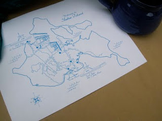
Custom Wedding Map

Shelter Island
This custom map was commissioned for a couple who recently visited Shelter Island located in Long Island, New York.  I enjoyed seeing the images of this charming island,  The small cafes, boutique groceries, and lovely beaches make the island seem a delightful place to visit.
This map includes roads to facilitate navigation through the winding roads of the island and small illustrations of some "favorite" spots on the island.
Have you visited Shelter Island?
Pin It!

Tuesday, July 19, 2011

Western Avenue Series

Mile 11: 42nd-34th Streets
This sketch is a part of my Western Avenue Series, through which I'll be making 24 watercolor paintings, one to document each mile of Western Avenue, in Chicago.  I started this project because while it is not considered to be among the most “beautiful” of Chicago’s streets, Western Avenue is a perfect place to document the humanness of Chicago, the positive and the negative. In the words of Stuart Dybek, "Western, with apologies to State Street, is a great street,  Unlike State, it is a street that goes to the interior, the heart of the city, as it glides and glows through a United Nations of neighborhoods."  Check back next Monday to see the painting completed based on this sketch.
This mile is similar in character to the one which proceeds it.  The street remains wide, with the avenue split by a boulevard-style median.  One feels aware of the large volume of asphalt forming the street.  The buildings are a mix of residential and industrial mingling to create a strange balance. 

The width of the street is accentuated at a portion of the street which is crossed by a highway and a set of train tracks.  One finds some relief near the northern end of this mile, with McKinley Park running along the eastern edge of the avenue.  


I was particularity drawn to making a painting of this corner store because of the Schlitz logo on the side of the building.  It's a common marker on old eating and drinking establishments in Chicago.  The Joseph Schlitz Brewing Company was an American brewery based in Milwaukee, Wisconsin and was once the largest producer of beer in the world. Its namesake beer, Schlitz, was known as "The beer that made Milwaukee famous" and was famously advertised with the slogan "When you're out of Schlitz, you're out of beer" The Schlitz company began to succeed after the Great Chicago Fire of 1871, when Schlitz donated thousands of barrels of beer to that city, which had lost most of its breweries. He quickly opened a distribution point there, beginning a national expansion. Schlitz built dozens of tied houses in Chicago, most with a concrete relief of the company logo embedded in the brickwork.

Do you know buildings in Chicago with the Schlitz logo?
Pin It!

Monday, July 18, 2011

Western Avenue Series

Mile 10: 50th-42nd Street
This painting is a part of my Western Avenue Series, through which I'll be making 24 watercolor paintings, one to document each mile of Western Avenue, in Chicago.  I started this project because while it is not considered to be among the most “beautiful” of Chicago’s streets, Western Avenue is a perfect place to document the humanness of Chicago, the positive and the negative. In the words of Stuart Dybek, "Western, with apologies to State Street, is a great street,  Unlike State, it is a street that goes to the interior, the heart of the city, as it glides and glows through a United Nations of neighborhoods."  Check back next Monday to see a post about the next mile of Western.
One of the things that I love about Chicago is that evidence of it's industrial past still remains.  If one wanders north along the river near to North & Clybourn, remnants of the of the manufacturing that helped to build our city remain, like the Finkel Steel Factory.  Western Avenue is certainly a place where this industrial past and present remain a part of this fabric.  I was a bit surprised at the sprawling Wheatland Tube Company that occupies the same mile stretch as this pumping station.  


The pumping station reflects that which attracts me to Western Avenue.  It's real, it's part of what make our city run.  It impels water to our homes and businesses, fulfilling the most essential need of city residents.  And yet, while its a functional element of our city infrastructure, it is also beautiful.  It is elegantly designed and yet solid in appearance.    


Click here to purchase this painting.
Pin It!

Sunday, July 17, 2011

Other Projects

CAAP Grant
I'm very pleased to announce that I received a 2011 CAAP grant.  I applied for the grant in late January and found out in May that I had been awarded the grant.  I'll be using the grant money to purchase supplies for the framing of my Western Avenue Series paintings.  It's a great small grant for Chicago-based artists. 
Photo by vallartablog.com
From the City of Chicago website, "The Community Arts Assistance Program (CAAP) was created in 1987 through funding provided by the Illinois Arts Council Access Program. The goals of CAAP are to discover, nurture and expand Chicago’s multi-ethnic artists and nonprofit arts organizations; and to foster new and emerging individual artists and arts groups by providing grants for professional, artistic, and organizational development to those who have had limited access to funding in both public and private grants programs."

What are some other small arts grants?
Pin It!

Friday, July 15, 2011

Featured Artist

Suzanne Nocera
This week we have a fantastic guest post by Suzanne Nocera of Torn Paper Studio.  She has put together demonstration of how she creates her ACEO (art card edition and original) paintings.  These paintings are studies in color and design that she paints before planning a larger painting.  Check out this inside view of how Sue creates small pieces of art! 
Step 1. Taping off size to paint miniature.
I paint to feel the warmth of sunlight and the blue coolness of moonlight, the softness of pink tulips or the freshly washed skins of green apples.
I paint because I’d simply rather do nothing else.
Step 2.  Simple leaves drawing.
Step 3.  Simple leaves aureolin wash.
My artwork begins with layers of poured paint. The process of pouring paint is methodical, yet mindlessly therapeutic for the soul.
Step 4. Simple leaves viridian wash.

The collage paintings are layers of paper and paint. Handmade & hand painted papers, fibers and inks play hide & seek in my collage paintings.
Step 5. Simple leaves negative paint of cobalt, ultramarine blue, and garnet lake.
    Textured papers of handmade organic elements meld color and shape together to entertain the viewer and please the soul.
Step 5.  Simple leaves pen & ink.
Many thanks to Suzanne Nocera for sharing her work.  Chicagoans, be sure to stop into Vale Craft Gallery over the summer to see four of her fine art collage paintings.

What do you think of these small scale creations?
Pin It!

Sunday, July 10, 2011

Other Projects

Cheerleading for Baltimore  
  Since I moved away almost five years ago, Baltimore has tugged at my heart.  I can go months without thinking of the city, but when something brings it to mind, I find myself longing for this lost love.  As a short time adopted resident of Baltimore, I was proud to tell people I called Charm city home and to champion the place, disputing claims that Baltimore is merely a crime-ridden, dirty, second rate city. 

     I find myself wondering about and wanting the ability to articulate Baltimore’s appeal.  Certainly, there is a segment of Baltimore’s population who are wholly discontented with the place.  They see it as a poor substitute for New York, too gritty, too provincial, or too small to be considered cosmopolitan.  Baltimore has a lot of faults to be sure: segregation, a poor public school system and poor conditions for bike transportation, to name a few.  I am not advocating for complacency in these unfortunate qualities, but offering a reminder that we all want for others to see past our faults.  We revel in the chance to recognize beauty in that which is not “beautiful” by societal standards.  So, why not offer Baltimore that benefit for she has great beauty despite her faults.

    As a watercolor painter I find the images of Baltimore completely captivating.  In contrasting Charm City with it nearest counterpart Washington D.C., I often used the words gritty and industrial.  Those words unfairly flatten the depth of the city’s character.  The visibility and aesthetic pleasure of the Baltimore’s history, in the urban landscape, make for extraordinary compositions.  I have quite contentedly painted the Domino Sugar Factory and the Mr. Boh signs and wondered at the nostalgia I felt for these neon advertisements.  They are simultaneously iconic reminders of Baltimore’s historic and contemporary industry, beautiful, wholly associated with the place, and part of Baltimore’s identity in the present, which feels personal.

    Beyond the grand scenes I associate with Baltimore there are many hidden corners that speak of the city’s admirable qualities.  The houses on Buena Vista for several blocks north of 36th street are an example of the absolutely impossible to replicable essence of Baltimore.  The houses have the charm of quaint cottages in a small town on the East Coast.  I can imagine them nestled in trees just steps from a path down to the beach.  The lure of these places doesn’t come from Crate and Barrel teak lounge chairs on the generous front porches.  These houses still appear to be working hard for the working class.  I marvel at the nobility of these houses and the wonderful 2-story brick rowhouses of 37th west of Buena Vista.  They march along the street in service of people who have a Baltimore lineage of several generations and a long memory of the neighborhood.  The city’s vernacular housing with its somewhat squat proportions and formstone facades is somewhat humble, whimsy tempered by grit. 
 
    People describe Baltimore as a big city, with a small town feel.  When I moved to Baltimore, this sounded appealing, but I couldn’t conceptualize what this meant.  For me this was manifest in places like the downtown farmer’s market.  While some cities have a farmer’s market for in every neighborhood offering great variety in plein air produce shopping, I have rarely enjoyed a market as much as I did the downtown farmer’s market under the JFX viaduct.  The market draws people from geographically disparate parts of the city, increasing the likelihood that you will run into someone unexpected on a Sunday morning.  Like many markets, it has an extraordinary energy and offers opportunities to develop a more personal relationship with those who produce our food.   The market also seems quite uniquely “Baltimore.”  On Sunday mornings, what is not a traditionally beautiful place—a large swath of asphalt tucked under a highway is transformed.  The choice of this location is at once practical, cleaver, and in a way completely charming.  
    Baltimore is a city that offers unbelievably quaint enclaves in places  like Mt. Washington, cultural attractions combined with gay pride in Mt. Vernon, diversity in neighborhoods like Pigtown, colorful, dense housing stock in Charles Village, lush university campuses, an extraordinary collection of the works of Matisse, and many neighborhoods which offer the  opportunity to for transformation to healthy, community-orientated places, investment in the collective good.  In this, I see the unexpected beauty of a place that doesn’t always live up to the glamour of flashier cities, but doesn’t disappoint those who seek the hidden potential of the place.  

      Nelson Algren, said that loving Chicago, my present home, was "Like loving a woman with a broken nose, you may well find lovelier lovelies. But never a lovely so real."  I would say of Baltimore that it is like falling in love unexpectedly, you may well find a more perfect lover.  But never have you been so charmed.

Do you know the charms of Baltimore?
Pin It!

Friday, July 8, 2011

Featured Artist

Rosemarie Montefusco
Rosemarie Montefusco is an artist and writer from New York. Her hobbies include gardening, hiking, crochet, botany, entomology, and collecting riker-mounted insects, especially Saturniidae moths.  She currently lives in a small cottage with a black cat named Lurleen and owns far too many mugs than any one person should.
     She’s in the process of writing her second novel and self producing audio excerpts from her first novel: A Moonserpent Tale.
What attracts you to watercolor as a medium?
I find watercolors offer a juxtaposed appeal, which gives me the best of both worlds when it comes to illustration and art. For illustration purposes, they give me the control to define lines, sharp light, shadow and texture, so I can accurately portray the specifics of a given subject. But for more traditionally artistic and expressive purposes, watercolors offer freedom and flexibility that allows unexpected things to happen.  I also love them for their economy and convenience. I paint in acrylics as well but not nearly as often for the fact that transport and setup is a bit more involved.  I love that I can carry my watercolor setup just about anywhere, from the middle of the woods, the beach, or just a different room of my home. Hate to say that cost drives my creative process, but canvas and tubes do add up very quickly compared to cold press paper and half-pan refills.

Does your work as a writer influence your painting?  Do you find yourself telling stories through your paintings?
My writing certainly influences my paintings, but not nearly as much as my painting seems to influence my writing.  As a kid, I loved drawing and painting a scene, then I’d find an audience member or two and explain what was going on in the painting.  I can’t think of too many specifics—only a few that involved some sea monsters that were summoned by the setting sun.  When writing, my background as a visual artist really comes into play through description of settings and characters—lots of specific adjectives that I usually end up cutting for the sake of word count and reader sanity.  For me, there’s just something about painting and writing that enables me to define the world I’m creating.  In both my paintings and my fiction, especially since most of my work is fantasy, it’s very important to me that things look and feel a particular way.  In writing you have to let go of some that and trust your reader’s imagination, but with painting the specific shades, textures and other physical qualities of a subject are totally up to you.  An art background also comes in handy when it comes to illustrations and cover design.  I love books that have a strong cohesion between the style of writing and the style of illustration, and when they’re coming from the same hand, there’s all the greater chance of achieving that feel.
Are there new themes or mediums you anticipate exploring in your upcoming work?
I’m still very new to scientific and naturalist illustration.  There’s endless subject matter there for me to explore.  I’d like to do more series pieces in that subject realm.  I planned out a serious of small marsupials, each one paired with a single species of native flora.  That may still come to be.  I’d like to do more narrow vertical and horizontal style paintings.  There’s just something about that limited space within a canvas that’s very appealing for me.  It makes the painting easier to “attack”—they’re also nice when you have limited wall space or narrow niches between windows, doors and other paintings.  Mixed media pieces with colored pencil illustration in addition to watercolor are also somewhere on the horizon.  I may even add some henna watercolor pieces in there as well. Mehndi looks pretty cool on a wall in addition to the palm of your hand.
Many thanks to Rosemarie for sharing her fantastic watercolors!

What do you think of the stories told through Rosemarie's paintings?
Pin It!

Wednesday, July 6, 2011

Wedding Map

Chicago Map
I recently designed this in progress wedding map for a couple who will marry this July in Chicago.  They are crafting a handmade, DIY wedding, with invites made on 5x7 folded kraft cards. The couple bought a typewriter and has been typing all the paper products. 
They wanted a wedding map with a vintage feel, so I designed this custom map for them.  It was a pleasure to create a wedding map for my home city, with familiar landmarks in the Chicago's Little Italy and Fulton Market areas. 
Are you fond of vintage maps?
Pin It!

Sunday, July 3, 2011

Other Projects

Cheap Eats in Chicago
This week I had dinner at Ghareeb Nawaz, a Indian-Pakistani restaurant on Devon in Chicago.  The name means 'sustainer of the poor, which is appropriate given that a meal for two with leftovers was $7.17 (with tax).  It's a no frills kind of place, the service is minimal, customers order and pay at the counter, the booths are basic and the tableware is limited to plastic utensils.

We had:
Veggie Biryani $2.00
Veggie Paratha $2.00
Tandoori Naan $.50
4 Potato Samosa ($.50 each) $2.00

The food was tasty, I particularly like the saucy Veggie Paratha, but mainly I was just perplexed by the volume of food for just over $7!

What are your favorite cheap eats? 
Pin It!

Friday, July 1, 2011

Featured Artist

Alisha Koyanis
Alisha Koyanis has been creating since before she knew what create meant.  She loves creating new art and is inspired by those around me.  During the day, she works as an Art teacher.  She teaches grades K-8 and loves it.  Alisha works mainly with Acrylics, but she dabbles in many mediums.  She is an artist thinks she should experiment in all types of art.

Where do you find inspiration for your paintings?
Everywhere. Colors mainly attract me. Yes I am one of those that will buy the most mundane items just for their colorful packaging. My mother can be the one to blame for my obsession with color. At a very young age she would dress me from head to toe in the most colorful outfits and send me on my way. I was commonly referred to as “Punky” growing up for my mismatch rainbow outfits. Without her whimsical eclectic style and my boyfriends constant support I might not be the artist I am today.

Does your work as an art teacher influence your work?
Absolutely! I’ve never felt like such a rock star artist until I had students. They are always telling me what a great artist I am, even though many times I’m just scribbling doodles for them. Being an art teacher you really have to be thrifty with low budgets in order to come up with cool projects for the kids. They actually inspired my cardboard monsters. I had been collecting toilet paper rolls for them and had quite a collection at home. So one day when I was bored I grabbed a few of the rolls and just had at it. There is a lot of recycling common items into art when you’re an art teacher.

 
Are there new themes or mediums you anticipate exploring in your upcoming work?
Anything I can get my hands on that inspires me. I actually just bought an old 1980’s vintage Canon FT film camera that I found at a garage sale. I intend to bring it to Greece in a few weeks and try my hand at photography. I love the sound the classic shutters make as opposed to the new digital cameras they just don’t sound as cool.


Many thanks to Alisha for sharing her fantastic work.


What do you think of Alisha's whimsical, colorful paintings?
Pin It!